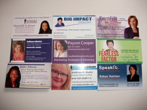
 I once heard a billionaire at an event tell people that if you include a photo on your card, you’re an idiot.
Well, she didn’t say idiot, but she did say enough to make my virtual assistant hide her business cards – which had her picture on it – deep into her luggage.
How selfish.
Business cards, just like your overall brand, must fit your story.
If you’re verbose and flamboyant, then put together a fold-up card. I’ve met people who have given me business cards that fold out into a small brochure. Then, fold it back up and it’s once again the size of a business card.
If you’re conservative or work in a stuffy industry, don’t include a photo. Just include your contact details and your company name embossed in gold across the top.
I once got a business card from some dude at a Podcamp event where he scrawled his name by hand on a piece of cardboard. Name, email and website. Sadly, I threw it out days later, but hey, that’s his story.
But more importantly, your business card must fit the various needs of your audience.
I learn best two ways – by seeing and by doing. That’s why audio books are horrible for me. My mind wanders, I get distracted. But, give me a book – either on an eReader or a physical copy in my hands and I’m good.
There are alot of people like me.
Visual learners need more than text to help them recall who you are and what you talked about. Business cards that have a photo on it help trigger the memory. And that’s one thing you want to be is memorable.
What other tips do you have on how to design a business card? Please share your comments below.

